Results-Driven Business Growth
Fill out the form and we’ll:
AT ALBION, WE DO THINGS DIFFERENTLY…
Looking for marketing campaigns that can pay for themselves many times over? We stake our reputation and our fee on getting great results. So if we don’t increase your rankings, traffic or sales (or reduce your cost per acquisition) you won’t pay a penny.
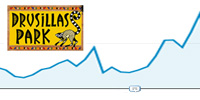
We helped a UK theme park achieve 70% more Google traffic and a large increase in sales on the previous year via a single campaign. We did this by taking SEO duties out of their web design agency’s hands, by optimising key pages, fixing hidden errors and redirecting old urls.
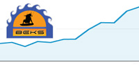
Generating almost 3 times more visits each week for a Kite Surfing brand was a feat that totally exceeded their expectations. And by teaching BEKS how to achieve top Google rankings they were able to complement our one-off campaign with further improvements in-house.
By investigating the problems Bar Seventy 6 were having with escalating paid advertising costs and identifying areas to be improved, we were able to cut their Google Ads budget in half whilst maintaining the same volume of paid traffic and sales, with no further work required.
Unless you are a leading leisure service or product brand it is likely that your website is wasting a large share of its visitors by neglecting to turn them into paying customers. Usually, this is because your company hired a “website design” agency to select a pre-designed, pre-built website template rather than creating one that has all the essentials others use to generate maximum bookings and sales. Worse is that they are totally unaware of conversion rate optimisation (CRO) best practices and split testing.
Over the years we have seen many times that this is one of the worst mistakes your leisure brand could make. Why? Well, because most generic website templates repeat the mistakes of other templates built before them – they simply don’t include layouts that are known to generate the most sales conversions. In addition, many web designers and in-house web editors don’t understand what wording works best to increase trust and online bookings.
Do you know for a fact that the wording on your homepage works better to generate sales than different wording? How do you know if your booking form is placed in the optimal location to engage your visitors and show them relevant products and services they are most likely to buy? And how do you know if your homepage is missing some of the most important elements people need to see before buying stuff online?
These questions can be answered in a scientific way by implementing A/B split testing. This, coupled with CRO best practices, allows you to answer definitely if one variation of your homepage layout or wording performs better than others. If you knew an element on your page turned people against your brand and encouraged them to hit the back button and buy from a competitor, you would change it right?
Take a look at your website and look at the below questions in order to find out if your reliance on a non-specialist web designer that lacks CRO insight is the main reason why fewer site visitors are converting into customers:
Does your booking form sit at the top of your homepage and contain just the fields it needs to?
If you answered no, then be aware that only a fraction of your visitors will bother to scroll down the page to fill out the form to see what is on offer. Likewise, only a small share of visitors will bother to click links in order to go and find your search and booking form. Just as important is the fact the more fields you have in the form, the fewer people will fill it out in order to see a list of relevant products and services. It’s best to have a form that asks visitors just what product type they are interested in or what dates they want to visit your attraction, so you will be able to serve them a list of options that best suit their needs. Hide your form down the page or force them to consult an availability calendar to see if their option is available or fully booked is an easy way to wave goodbye to a large section of your market. Make life easy for them and they won’t turn around and look elsewhere.
Does your homepage show a large slideshow that showcases your best offerings?
If you answer yes, then you may want to reconsider not only your homepage layout but also your web designer. Why? Simply put, homepage slideshows are one of the biggest “conversion killers” most marketing teams are unaware of. The reason is mainly that the important information displayed on slide 2, 3 and 4 is usually never seen by your visitors. So unless you repeat these benefits from buying from you elsewhere down the homepage, nobody will see your price guarantees, or quality assurance, your booking or payment options, or even the offers and discounts you want to promote. There is no better way of hiding the most important features of your products and services than hiding them in generic slideshows. Ideally, you have one main proposition and a list of benefits points alongside a call to action.
Is your search or booking form visible and easy to use in all devices?
Mobile phone users will hit the back button and buy elsewhere if they need to scroll right down the page in order to see the booking form or a relevant list of products. That’s simply the way it is. This is known to all good conversion rate optimisation experts, especially those who market leisure industry brands. Indeed, even if some of the form’s input fields are hidden from view or obscured by other elements such as cookie notices, then it is worth considering making design changes to the layout of your mobile-friendly site.
Do you highlight important trust elements so that visitors can skim read your homepage?
Countless brands such as theme parks, local attractions, museums and visitor centres suffer badly from generic website layouts that fail to make life easy for their users. Split-tests have shown time and again that unless your visitors can see the most common trust elements, they are much less likely to book their place at your attraction or buy products from your site. This is often due to the fact that many essential elements are an “after-thought” and are squeezed into inappropriate regions on generic templated websites. Logos of associations you are a member of, or logos of industry bodies you are governed by, as well as guarantees, testimonials and user reviews need to be highly visible. Otherwise, they trigger alarm bells in the mind of your potential customer, who is less and less likely to trust your brand and buy your wares.
Do you help new customers choose a product and let existing customers convince them to buy?
Many potential customers who are looking to buy leisure products or book days out at events and attractions are often unsure exactly what it is they want. They came to your site to see what is on offer and see what they can do. By showing them ratings and reviews, submitted by existing customers, you can easily guide them toward options which will suit their needs. Not only that, but by including sections on your homepage that list the most popular, most recently added and most discounted options, you can encourage them to view the products you most want to sell, whether that’s visits on quiet periods of the season or products that generate the most profit.
The above best practices are well known to the many conversion rate optimisation consultants that work in the leisure sector. However, only the market leaders have taken the time to take advantage of what have been proven time and time again to generate the best results from the same volume of website traffic. Indeed, any savvy CRO expert would be able to take a glance at your website and point out a whole range of “friction points” and untapped easy-wins your site was actually created to cash in on. The most important thing to ask is: are your profits reliant on a web designer you hired years ago and do you take steps to optimise the site for more bookings and profits from the online traffic you attract?
Albion makes the process of creating new variations of your homepage or booking form layout a simple one. We use a range of A/B split testing tools such as Optimizely to make the changes both your and our team suggest. We then send a share of your existing traffic to each variation and allow you to sit back and monitor the results as they come in. Then when you are ready, you can give your web developer or our team the go-ahead to implement the winning variations. This is how leading leisure brands make the most use of their traffic and how many of them became large brands in the first place. It is also likely one of the most important ways your company could tap into that industry intelligence to achieve ongoing growth.
Keeping turnstiles spinning at one of the UK’s most loved theme parks
As a popular zoo and theme park in the UK, our client has to keep hundreds of families (and other animals) happy and fed every day as well as keeping the park busy. We work with their in-house team and have contributed to their busiest seasons to date via top Google rankings and a range of online advertising campaigns.
Ensuring ongoing growth for a recreational vehicle hire brand
With hundreds of happy customers under their belt, Portugal based Siesta Campers have been first choice for campervan hire for almost a decade. However, the launch of a new site saw their traffic and sales drop do the ground – that is, until we came in to resolve the problems and increase their online sales from search traffic.
Recovering lost online sales for a popular educational app store
The benefits of supplementing lessons at school and home using learning apps are enjoyed by teachers, parents and children around the globe. But when the UK’s most popular educational app store saw their online traffic drop after a continued period of growth, they called Albion in to show them how to turn their fate around.

